アイコン付きボタンを作る方法
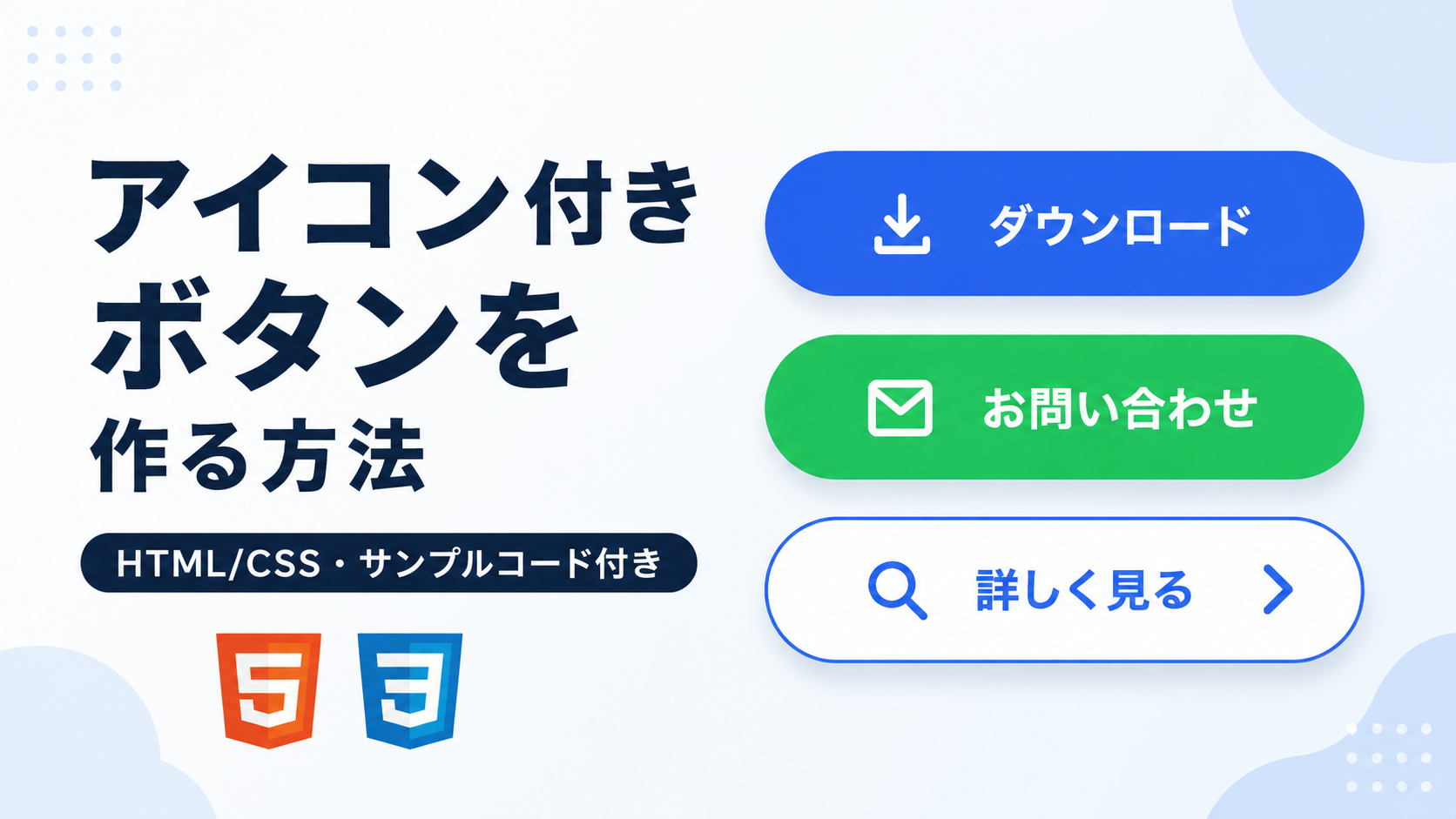
アイコン付きボタンを作る方法を紹介します。ボタンの中にアイコンとテキストを並べることで、ボタンの意味を視覚的に伝えやすくなります。文字だけのボタンよりも用途が分かりやすく、ダウンロード、送信、検索、詳細表示など、さまざまな操作ボタンに活用できます。
このサンプルでは、HTMLとCSSだけを使ってアイコン付きボタンを作成します。アイコン部分にはテキスト記号を使い、CSSの display:flex; と gap でアイコンと文字を横並びにします。JavaScriptや外部アイコンライブラリを使わないため、シンプルに導入できます。
WebサイトのCTAボタン、フォームの送信ボタン、一覧ページの詳細ボタンなど、ユーザーに操作内容を分かりやすく伝えたい場面で便利です。アイコン、色、余白、角の丸み、文字サイズはCSSから変更できるため、サイトのデザインに合わせてカスタマイズできます。
コードについて
本記事のコードはサンプルコードです。ご利用前に必ず動作確認を行ってください。
免責事項 本コードの利用により発生した損害について、当サイトは一切の責任を負いません。
免責事項 本コードの利用により発生した損害について、当サイトは一切の責任を負いません。
デモ
コードをコピーして使おう!
<!DOCTYPE html>
<html lang="ja">
<head>

  <!-- 文字コード -->
  <meta charset="UTF-8">

  <!-- スマホ表示に対応 -->
  <meta name="viewport" content="width=device-width, initial-scale=1.0">

  <!-- ページタイトル -->
  <title>アイコン付きボタン</title>

  <!-- CSSファイルを読み込み -->
  <link rel="stylesheet" href="style.css">

</head>
<body>

  <!-- ボタン配置エリア -->
  <div class="icon-button_wrap">

    <button class="icon-button_button icon-button_button-blue" type="button">
      <svg class="icon-button_icon" viewBox="0 0 24 24" aria-hidden="true">
        <path d="M12 3v10" fill="none" stroke="currentColor" stroke-width="2.6" stroke-linecap="round"/>
        <path d="M7.5 9.5 12 14l4.5-4.5" fill="none" stroke="currentColor" stroke-width="2.6" stroke-linecap="round" stroke-linejoin="round"/>
        <path d="M5 17v2.5h14V17" fill="none" stroke="currentColor" stroke-width="2.6" stroke-linecap="round" stroke-linejoin="round"/>
      </svg>
      <span>ダウンロード</span>
    </button>

    <button class="icon-button_button icon-button_button-green" type="button">
      <svg class="icon-button_icon" viewBox="0 0 24 24" aria-hidden="true">
        <rect x="3" y="5" width="18" height="14" rx="2" fill="none" stroke="currentColor" stroke-width="2.4"/>
        <path d="M4.5 7 12 13l7.5-6" fill="none" stroke="currentColor" stroke-width="2.4" stroke-linecap="round" stroke-linejoin="round"/>
      </svg>
      <span>お問い合わせ</span>
    </button>

    <button class="icon-button_button icon-button_button-outline" type="button">
      <svg class="icon-button_icon" viewBox="0 0 24 24" aria-hidden="true">
        <circle cx="10.5" cy="10.5" r="6.5" fill="none" stroke="currentColor" stroke-width="2.5"/>
        <path d="M15.5 15.5 21 21" fill="none" stroke="currentColor" stroke-width="2.5" stroke-linecap="round"/>
      </svg>
      <span>詳しく見る</span>
      <svg class="icon-button_icon icon-button_arrow" viewBox="0 0 24 24" aria-hidden="true">
        <path d="M9 5 16 12 9 19" fill="none" stroke="currentColor" stroke-width="2.8" stroke-linecap="round" stroke-linejoin="round"/>
      </svg>
    </button>

  </div>

</body>
</html>ファイル構成と設置方法
このサンプルは、HTMLとCSSの2ファイルで構成されています。HTMLに3種類のアイコン付きボタンを配置し、CSSでボタンの色や角の丸み、レイアウトを設定します。アイコンはHTML内へ直接記述したSVGを使用しているため、JavaScriptや外部アイコンライブラリを追加せずに利用できます。
sample/
├── index.html
└── style.css
2つのファイルを同じフォルダへ配置し、ブラウザで index.html を開くと動作を確認できます。サンプルにはダウンロード、お問い合わせ、詳しく見るの3種類のボタンを用意しています。ボタンの文字、色、角の丸み、余白、SVGアイコンの形や大きさはHTMLとCSSから自由に変更できるため、用途に合わせてカスタマイズできます。
コメント