カスタム確認ダイアログをモーダルウインドウ表示する方法【HTML/CSS/JavaScript・サンプルコード付き】
 html/css/js
2025.09.23
カスタム確認ダイアログをモーダルウインドウ表示する方法
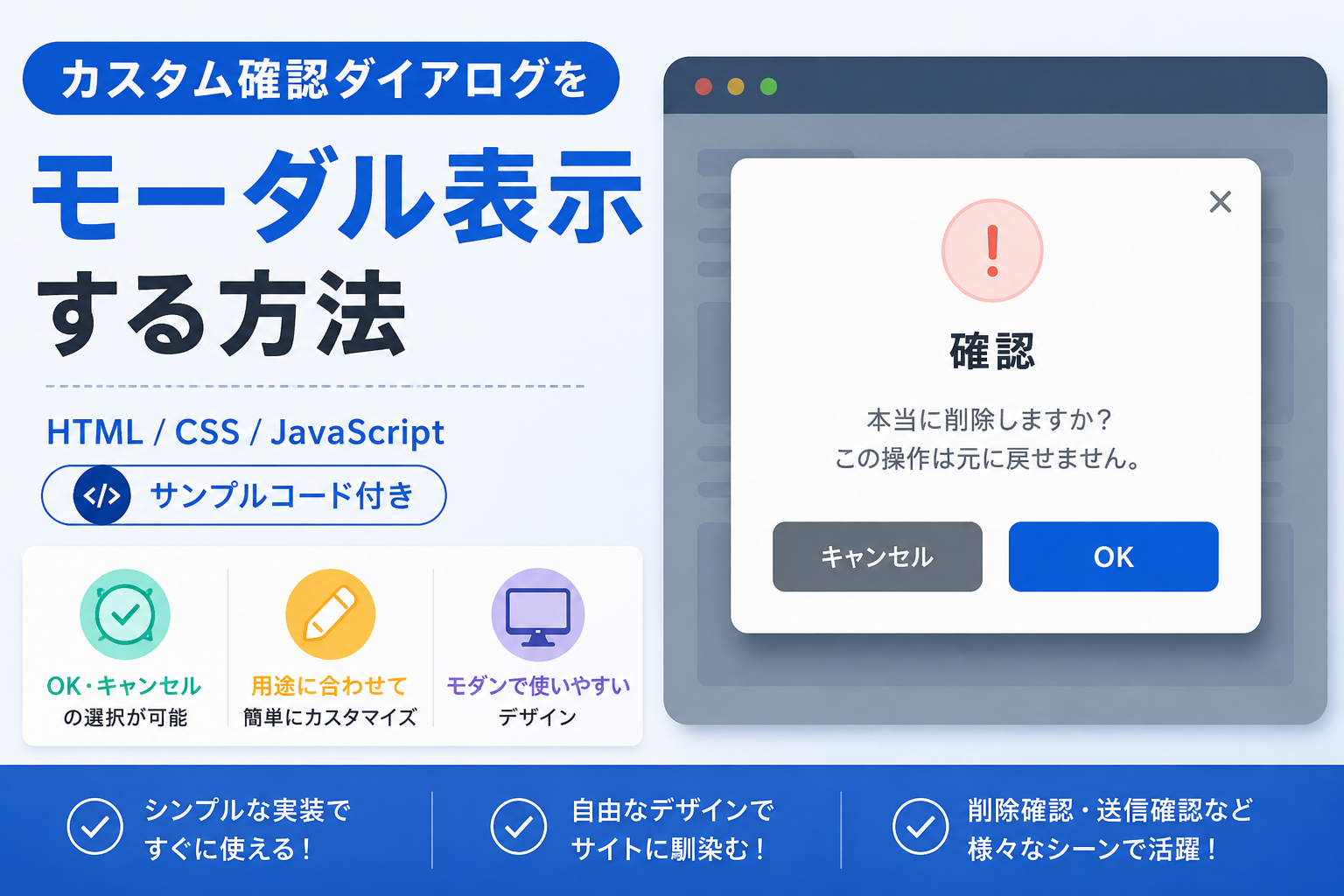
HTML・CSS・JavaScriptを使って、カスタム確認ダイアログをモーダルウインドウとして表示する方法を紹介します。このサンプルでは、「OK」と「キャンセル」を備えた確認画面を自由なデザインで実装でき、ボタンを押した結果も画面に反映できます。削除確認や送信確認、重要な操作の最終確認などを分かりやすく表示したい場合に便利です。
コードについて
本記事のコードはサンプルコードです。ご利用前に必ず動作確認を行ってください。
免責事項
本コードの利用により発生した損害について、当サイトは一切の責任を負いません。
デモ
カスタム確認ダイアログ
ボタンをクリックすると、自由にデザインできる確認ダイアログを表示します。
確認
本当に削除しますか?
この操作は元に戻せません。
コードをコピーして使おう!
<!DOCTYPE html>
<html lang="ja">
<head>

  <meta charset="UTF-8">

  <!-- ページタイトル -->
  <title>デザイン自由自在な確認ダイアログ</title>

  <!-- CSS読み込み -->
  <link rel="stylesheet" href="style.css">

</head>
<body>

  <!-- デモエリア -->
  <div class="custom-confirm-dialog-modal-window_wrap">

    <div class="custom-confirm-dialog-modal-window_title">
      カスタム確認ダイアログ
    </div>

    <p class="custom-confirm-dialog-modal-window_text">
      ボタンをクリックすると、自由にデザインできる確認ダイアログを表示します。
    </p>

    <!-- 確認ダイアログを開くボタン -->
    <button class="custom-confirm-dialog-modal-window_open" type="button" data-modal-open>
      削除する
    </button>

    <!-- 選択結果を表示するエリア -->
    <div class="custom-confirm-dialog-modal-window_result" data-result></div>

  </div>

  <!-- モーダル全体 -->
  <div class="custom-confirm-dialog-modal-window_overlay" data-modal-overlay>

    <!-- モーダル本体 -->
    <div class="custom-confirm-dialog-modal-window_modal" role="dialog" aria-modal="true">

      <div class="custom-confirm-dialog-modal-window_modal-title">
        確認
      </div>

      <p class="custom-confirm-dialog-modal-window_modal-text">
        本当に削除しますか?<br>
        この操作は元に戻せません。
      </p>

      <div class="custom-confirm-dialog-modal-window_buttons">

        <!-- キャンセルボタン -->
        <button class="custom-confirm-dialog-modal-window_cancel" type="button" data-modal-cancel>
          キャンセル
        </button>

        <!-- OKボタン -->
        <button class="custom-confirm-dialog-modal-window_ok" type="button" data-modal-ok>
          OK
        </button>

      </div>

    </div>

  </div>

  <!-- JavaScript読み込み -->
  <script src="script.js"></script>

</body>
</html>
/* ページ全体 */
body{

  margin:0;
  font-family:sans-serif;
  background:#ffffff;

}

/* デモエリア */
.custom-confirm-dialog-modal-window_wrap{

  max-width:700px;
  margin:40px auto;
  padding:32px;
  border:1px solid #e5e7eb;
  border-radius:18px;
  background:#f8fafc;
  text-align:center;

}

/* タイトル */
.custom-confirm-dialog-modal-window_title{

  font-size:22px;
  font-weight:700;
  margin-bottom:12px;

}

/* 説明文 */
.custom-confirm-dialog-modal-window_text{

  margin-bottom:24px;
  color:#4b5563;

}

/* 確認ダイアログを開くボタン */
.custom-confirm-dialog-modal-window_open{

  padding:12px 24px;
  border:none;
  border-radius:8px;
  background:#dc2626;
  color:#ffffff;
  font-weight:700;
  cursor:pointer;

}

/* モーダル背景 */
.custom-confirm-dialog-modal-window_overlay{

  display:none;
  position:fixed;
  inset:0;
  z-index:9999;
  background:rgba(0,0,0,0.5);
  align-items:center;
  justify-content:center;
  padding:20px;

}

/* モーダル表示時 */
.custom-confirm-dialog-modal-window_overlay.is-active{

  display:flex;

}

/* モーダル本体 */
.custom-confirm-dialog-modal-window_modal{

  width:100%;
  max-width:420px;
  padding:28px;
  border-radius:18px;
  background:#ffffff;
  text-align:center;
  box-shadow:0 20px 40px rgba(0,0,0,0.2);

}

/* モーダルタイトル */
.custom-confirm-dialog-modal-window_modal-title{

  font-size:22px;
  font-weight:700;
  margin-bottom:12px;

}

/* モーダル本文 */
.custom-confirm-dialog-modal-window_modal-text{

  margin-bottom:24px;
  color:#4b5563;
  line-height:1.8;

}

/* ボタンを並べるエリア */
.custom-confirm-dialog-modal-window_buttons{

  display:flex;
  justify-content:center;
  gap:12px;

}

/* キャンセルボタン・OKボタン */
.custom-confirm-dialog-modal-window_cancel,
.custom-confirm-dialog-modal-window_ok{

  padding:10px 20px;
  border:none;
  border-radius:8px;
  color:#ffffff;
  font-weight:700;
  cursor:pointer;

}

/* キャンセルボタン */
.custom-confirm-dialog-modal-window_cancel{

  background:#6b7280;

}

/* OKボタン */
.custom-confirm-dialog-modal-window_ok{

  background:#2563eb;

}

/* 選択結果 */
.custom-confirm-dialog-modal-window_result{

  margin-top:20px;
  font-weight:700;

}
// 確認ダイアログを開くボタンを取得
const modalOpen=document.querySelector("[data-modal-open]");

// モーダル背景を取得
const modalOverlay=document.querySelector("[data-modal-overlay]");

// キャンセルボタンを取得
const modalCancel=document.querySelector("[data-modal-cancel]");

// OKボタンを取得
const modalOk=document.querySelector("[data-modal-ok]");

// 選択結果を表示するエリアを取得
const result=document.querySelector("[data-result]");

// 開くボタンをクリックしたときの処理
modalOpen.addEventListener("click",function(){

  modalOverlay.classList.add("is-active");

});

// キャンセルボタンをクリックしたときの処理
modalCancel.addEventListener("click",function(){

  modalOverlay.classList.remove("is-active");
  result.textContent="キャンセルしました。";

});

// OKボタンをクリックしたときの処理
modalOk.addEventListener("click",function(){

  modalOverlay.classList.remove("is-active");
  result.textContent="削除しました。";

});

// 背景部分をクリックしたときの処理
modalOverlay.addEventListener("click",function(event){

  if(event.target===modalOverlay){

    modalOverlay.classList.remove("is-active");

  }

});
ファイル構成と設置方法
このサンプルは、HTML・CSS・JavaScriptをそれぞれ別ファイルに分けて使用します。index.html、style.css、script.js を同じフォルダに配置してください。
sample/
├── index.html
├── style.css
└── script.js
index.html をブラウザで開くと、「削除する」ボタンをクリックした際にカスタム確認ダイアログを表示できます。「OK」または「キャンセル」を押すとモーダルが閉じ、選択結果が画面上に表示されます。ダイアログ内の文言やボタンのデザインは用途に合わせて自由に変更できます。
カスタム確認ダイアログをモーダルウインドウ表示する方法【HTML/CSS/JavaScript・サンプルコード付き】
コメント