3D回転しながら開閉するモーダルウインドウの作り方
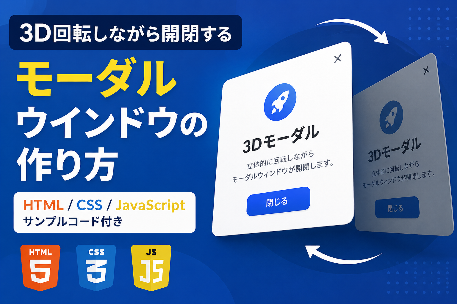
3D回転しながら開閉するモーダルウインドウの作り方を紹介します。通常のフェード表示やスライド表示とは異なり、立体的に回転しながら表示・非表示が切り替わるため、印象的なUIを簡単に実装できます。商品紹介やギャラリー、キャンペーン案内など、ユーザーの目を引きたい場面にも適しています。
このサンプルでは、HTML・CSS・JavaScriptだけを使用して、モーダルウインドウを3D回転アニメーション付きで表示します。開くときは奥から手前へ回転しながら現れ、閉じるときは逆方向へ回転しながら非表示になります。外側クリックや閉じるボタンにも対応しているため、実用的なサンプルとして利用できます。
デザインや色、サイズ、アニメーション速度、回転角度などはコード内の値を変更するだけで自由にカスタマイズできます。立体感のあるモーダルウインドウを導入したい場合や、一般的なモーダルよりも演出を強化したい場合に活用してください。
コードについて
本記事のコードはサンプルコードです。ご利用前に必ず動作確認を行ってください。
ご利用によって発生した損害・トラブル等については責任を負いかねますのでご了承ください。
デモ
3D回転モーダル
「3Dモーダルを開く」をクリックすると、立体的に回転しながら表示されます。
3Dモーダル
奥から手前へ立体的に回転しながら表示されています。
「3Dモーダルを開く」をクリックすると立体的に回転しながら表示されます。「閉じる」「×」ボタン、または背景部分をクリックすると逆方向へ回転しながら閉じます。
コードをコピーして使おう!
<!DOCTYPE html>
<html lang="ja">
<head>

  <!-- 文字コード -->
  <meta charset="UTF-8">

  <!-- スマートフォン表示対応 -->
  <meta name="viewport" content="width=device-width, initial-scale=1.0">

  <!-- ページタイトル -->
  <title>3D回転しながら開閉するモーダルウインドウ</title>

  <!-- CSSファイルを読み込み -->
  <link rel="stylesheet" href="style.css">

</head>
<body>

  <!-- 3D回転モーダルを開く操作エリア -->
  <div class="three-d-rotate-modal-window_wrap">

    <!-- 操作エリアのタイトル -->
    <div class="three-d-rotate-modal-window_title">
      3D回転モーダル
    </div>

    <!-- 操作エリアの説明文 -->
    <p class="three-d-rotate-modal-window_text">
      「3Dモーダルを開く」をクリックすると、立体的に回転しながら表示されます。
    </p>

    <!-- 3D回転モーダルを開くボタン -->
    <button
      class="three-d-rotate-modal-window_open"
      type="button"
      data-three-d-rotate-modal-window-open>
      3Dモーダルを開く
    </button>

  </div>

  <!-- モーダル背景 -->
  <div
    class="three-d-rotate-modal-window_overlay"
    data-three-d-rotate-modal-window-overlay>

    <!-- 3D回転するモーダル本体 -->
    <div
      class="three-d-rotate-modal-window_modal"
      role="dialog"
      aria-modal="true"
      aria-labelledby="three-d-rotate-modal-window-title">

      <!-- モーダル右上の閉じるボタン -->
      <button
        class="three-d-rotate-modal-window_close"
        type="button"
        data-three-d-rotate-modal-window-close
        aria-label="閉じる">
        ×
      </button>

      <!-- モーダルタイトル -->
      <div
        class="three-d-rotate-modal-window_heading"
        id="three-d-rotate-modal-window-title">
        3Dモーダル
      </div>

      <!-- モーダルの説明文 -->
      <p class="three-d-rotate-modal-window_message">
        奥から手前へ立体的に回転しながら表示されています。
      </p>

      <!-- モーダル下部の閉じるボタン -->
      <button
        class="three-d-rotate-modal-window_button"
        type="button"
        data-three-d-rotate-modal-window-button>
        閉じる
      </button>

    </div>

  </div>

  <!-- JavaScriptファイルを読み込み -->
  <script src="script.js"></script>

</body>
</html>
/* ページ全体 */
body{
  margin:0; /* ページ外側の余白をなくす */
  padding:40px 20px; /* 上下40px・左右20pxの余白 */
  background:#ffffff; /* ページ全体の背景色 */
  color:#111827; /* ページ全体の基本文字色 */
  font-family:sans-serif; /* ページ全体のフォント */
  box-sizing:border-box; /* paddingと枠線を要素サイズに含める */
}

/* 3D回転モーダルを開く操作エリア */
.three-d-rotate-modal-window_wrap{
  max-width:700px; /* 操作エリアの最大横幅 */
  margin:40px auto; /* 上下40pxの余白を付けて左右中央へ配置 */
  padding:32px; /* 操作エリア内側の余白 */
  border:1px solid #e5e7eb; /* 操作エリアの枠線 */
  border-radius:18px; /* 操作エリアの角丸 */
  background:#f8fafc; /* 操作エリアの背景色 */
  text-align:center; /* 内容を中央揃え */
  box-sizing:border-box; /* paddingと枠線を横幅に含める */
}

/* 操作エリアのタイトル */
.three-d-rotate-modal-window_title{
  margin:0 0 12px; /* 下側12pxの余白 */
  color:#111827; /* タイトルの文字色 */
  font-size:22px; /* タイトルの文字サイズ */
  font-weight:700; /* タイトルを太字にする */
  line-height:1.5; /* タイトルの行間 */
}

/* 操作エリアの説明文 */
.three-d-rotate-modal-window_text{
  margin:0 0 24px; /* 下側24pxの余白 */
  color:#4b5563; /* 説明文の文字色 */
  font-size:16px; /* 説明文の文字サイズ */
  line-height:1.8; /* 説明文の行間 */
}

/* 3D回転モーダルを開くボタン */
.three-d-rotate-modal-window_open{
  padding:12px 26px; /* ボタン内側の上下・左右余白 */
  border:none; /* ボタンの枠線を非表示 */
  border-radius:8px; /* ボタンの角丸 */
  background:#2563eb; /* ボタンの背景色 */
  color:#ffffff; /* ボタンの文字色 */
  font-size:16px; /* ボタンの文字サイズ */
  font-weight:700; /* ボタン文字を太字にする */
  line-height:1.5; /* ボタン文字の行間 */
  cursor:pointer; /* マウスカーソルを指型へ変更 */
}

/* モーダル背景 */
.three-d-rotate-modal-window_overlay{
  position:fixed; /* 画面全体へ固定 */
  inset:0; /* 上下左右を0にして画面全体へ広げる */
  z-index:9999; /* 他の要素より前面へ表示 */
  display:flex; /* モーダル本体を中央へ配置 */
  align-items:center; /* モーダル本体を縦中央へ配置 */
  justify-content:center; /* モーダル本体を横中央へ配置 */
  padding:20px; /* 画面端との余白 */
  background:rgba(15,23,42,.65); /* 背景色。.65を大きくすると暗くなる */
  opacity:0; /* 初期状態では透明 */
  visibility:hidden; /* 初期状態では操作できないようにする */
  perspective:1000px; /* 3D回転の奥行き。値を小さくすると遠近感が強くなる */
  transition:
    opacity .4s,
    visibility .4s; /* 0.4秒で背景の表示状態を切り替える */
  box-sizing:border-box; /* paddingを画面幅に含める */
}

/* モーダル背景の表示状態 */
.three-d-rotate-modal-window_overlay.is-active{
  opacity:1; /* モーダル背景を表示 */
  visibility:visible; /* モーダルを操作可能にする */
}

/* 3D回転するモーダル本体 */
.three-d-rotate-modal-window_modal{
  position:relative; /* 右上の閉じるボタンの配置基準 */
  width:100%; /* 画面幅に合わせて縮小 */
  max-width:430px; /* モーダルの最大横幅 */
  padding:48px 28px 28px; /* 上48px・左右28px・下28pxの内側余白 */
  border-radius:18px; /* モーダル本体の角丸 */
  background:#ffffff; /* モーダル本体の背景色 */
  box-shadow:0 24px 60px rgba(0,0,0,.3); /* モーダル本体の影 */
  text-align:center; /* モーダル内の内容を中央揃え */
  opacity:0; /* 初期状態では透明 */
  transform:
    rotateX(-75deg)
    rotateY(35deg)
    scale(.7); /* 縦方向と横方向へ回転し、70%まで縮小した状態 */
  transform-origin:center center; /* モーダル中央を回転の基準にする */
  transform-style:preserve-3d; /* 子要素の3D空間を維持 */
  transition:
    transform .55s cubic-bezier(.2,.8,.2,1),
    opacity .4s; /* 回転は0.55秒、透明度は0.4秒で切り替える */
  box-sizing:border-box; /* paddingを横幅に含める */
}

/* モーダル本体の表示状態 */
.three-d-rotate-modal-window_overlay.is-active
.three-d-rotate-modal-window_modal{
  opacity:1; /* モーダル本体を表示 */
  transform:
    rotateX(0deg)
    rotateY(0deg)
    scale(1); /* 回転を元へ戻し、通常サイズで表示 */
}

/* モーダル右上の閉じるボタン */
.three-d-rotate-modal-window_close{
  position:absolute; /* モーダル右上へ配置 */
  top:12px; /* 上端からの位置 */
  right:12px; /* 右端からの位置 */
  width:36px; /* ボタンの横幅 */
  height:36px; /* ボタンの高さ */
  padding:0; /* ボタン内側の余白をなくす */
  border:none; /* ボタンの枠線を非表示 */
  border-radius:50%; /* ボタンを円形にする */
  background:#111827; /* ボタンの背景色 */
  color:#ffffff; /* ×印の文字色 */
  font-size:22px; /* ×印の文字サイズ */
  line-height:1; /* ×印の行間を詰める */
  cursor:pointer; /* マウスカーソルを指型へ変更 */
}

/* モーダルタイトル */
.three-d-rotate-modal-window_heading{
  margin:0 0 16px; /* 下側16pxの余白 */
  color:#111827; /* タイトルの文字色 */
  font-size:28px; /* タイトルの文字サイズ */
  font-weight:700; /* タイトルを太字にする */
  line-height:1.5; /* タイトルの行間 */
}

/* モーダルの説明文 */
.three-d-rotate-modal-window_message{
  margin:0; /* 外側余白をなくす */
  color:#4b5563; /* 説明文の文字色 */
  font-size:16px; /* 説明文の文字サイズ */
  line-height:1.8; /* 説明文の行間 */
}

/* モーダル下部の閉じるボタン */
.three-d-rotate-modal-window_button{
  width:100%; /* モーダル内の横幅いっぱいへ広げる */
  margin-top:28px; /* 上側28pxの余白 */
  padding:12px; /* ボタン内側の余白 */
  border:none; /* ボタンの枠線を非表示 */
  border-radius:8px; /* ボタンの角丸 */
  background:#2563eb; /* ボタンの背景色 */
  color:#ffffff; /* ボタンの文字色 */
  font-size:16px; /* ボタンの文字サイズ */
  font-weight:700; /* ボタン文字を太字にする */
  line-height:1.5; /* ボタン文字の行間 */
  cursor:pointer; /* マウスカーソルを指型へ変更 */
}

/* 画面幅640px以下 */
@media (max-width:640px){

  /* スマートフォン用の操作エリア */
  .three-d-rotate-modal-window_wrap{
    padding:24px 18px; /* 上下24px・左右18pxへ余白を縮小 */
  }

  /* スマートフォン用のモーダル本体 */
  .three-d-rotate-modal-window_modal{
    padding:48px 18px 20px; /* 上48px・左右18px・下20pxの内側余白 */
  }

}
// 3D回転モーダルを開くボタンを取得
const threeDRotateModalWindowOpen=document.querySelector(
  "[data-three-d-rotate-modal-window-open]"
);

// モーダル右上の閉じるボタンを取得
const threeDRotateModalWindowClose=document.querySelector(
  "[data-three-d-rotate-modal-window-close]"
);

// モーダル下部の閉じるボタンを取得
const threeDRotateModalWindowButton=document.querySelector(
  "[data-three-d-rotate-modal-window-button]"
);

// モーダル背景を取得
const threeDRotateModalWindowOverlay=document.querySelector(
  "[data-three-d-rotate-modal-window-overlay]"
);

// 3D回転モーダルを閉じる共通処理
function closeThreeDRotateModalWindow(){

  // モーダル背景から表示用クラスを削除
  threeDRotateModalWindowOverlay.classList.remove("is-active");

}

// 3D回転モーダルを開くボタンをクリックした時
threeDRotateModalWindowOpen.addEventListener("click",function(){

  // モーダル背景へ表示用クラスを追加
  threeDRotateModalWindowOverlay.classList.add("is-active");

});

// モーダル右上の閉じるボタンをクリックした時
threeDRotateModalWindowClose.addEventListener("click",function(){

  // 3D回転モーダルを閉じる
  closeThreeDRotateModalWindow();

});

// モーダル下部の閉じるボタンをクリックした時
threeDRotateModalWindowButton.addEventListener("click",function(){

  // 3D回転モーダルを閉じる
  closeThreeDRotateModalWindow();

});

// モーダル背景をクリックした時
threeDRotateModalWindowOverlay.addEventListener("click",function(event){

  // モーダル本体ではなく背景部分をクリックした場合だけ閉じる
  if(event.target===threeDRotateModalWindowOverlay){

    // 3D回転モーダルを閉じる
    closeThreeDRotateModalWindow();

  }

});
ファイル構成と設置方法
このサンプルはHTML・CSS・JavaScriptの3ファイルで構成されています。3D回転アニメーションを使って、モーダルウインドウが奥から手前へ回転しながら表示される演出を実装しています。JavaScriptはモーダルの開閉制御のみを担当し、見た目やアニメーションはCSSで管理しています。
ファイルごとに役割を分けているため、デザインだけ変更したい場合はCSS、表示内容を変更したい場合はHTML、開閉動作を変更したい場合はJavaScriptというように、編集箇所が分かりやすい構成になっています。
サンプルはそのままブラウザで動作確認できます。タイトル・説明文・ボタン・色・アニメーション速度なども自由に変更できるため、自分のサイトに合わせた3Dモーダルへ簡単にカスタマイズできます。
sample/
├── index.html
├── style.css
└── script.js
各ファイルの役割
index.html
モーダル本体、タイトル、説明文、開くボタン、閉じるボタンを配置しています。表示する文章やボタン名を変更できます。
style.css
モーダルのデザイン、背景色、角丸、影、3D回転アニメーション、表示位置、レスポンシブ表示を管理しています。見た目を変更したい場合はこのファイルを編集します。
script.js
モーダルの表示・非表示、背景クリックによる閉じる処理、ボタン操作を管理しています。
設置方法・使い方
sampleフォルダ内の3ファイルを同じ場所へ保存します。
index.htmlをブラウザで開くとサンプルを確認できます。
「3Dモーダルを開く」ボタンをクリックすると、立体的に回転しながらモーダルウインドウが表示されます。
カスタマイズできる内容
index.htmlではタイトル、説明文、ボタン名を変更できます。
style.cssでは背景色、文字色、角丸、余白、影、モーダルサイズ、3D回転演出などを変更できます。
script.jsでは開閉処理や背景クリック時の動作を変更できます。
数値調整
style.css
transition:.55s;
0.55秒で3D回転アニメーションを実行します。値を大きくするとゆっくり、小さくすると速くなります。
style.css
perspective:1000px;
3D演出の奥行きを指定しています。値を小さくすると立体感が強くなり、大きくすると遠近感が弱くなります。
style.css
transform:rotateX(-75deg) rotateY(35deg) scale(.7);
モーダルの初期角度と拡大率です。回転角度やscaleの値を変更すると3D演出が変化します。
レスポンシブ対応
style.cssでレスポンシブ対応しています。
max-width:430pxで画面幅に合わせて縮小表示し、640px以下ではpaddingを調整してスマートフォンでも見やすいレイアウトになります。PC・タブレット・スマートフォンで利用できます。
.png)
コメント