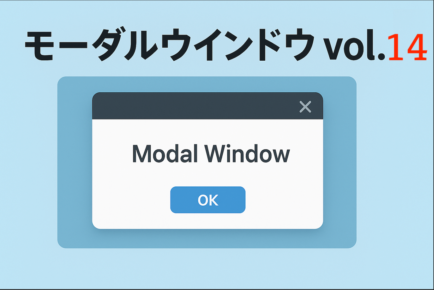
確認ダイアログをモーダル表示
ブラウザ標準の alert() や confirm() はシンプルですが、デザインを変えられないのが欠点です。
今回はその代替として、確認ダイアログをモーダル表示する方法を紹介します。
「OK」と「キャンセル」の二択を備え、見た目を自由にカスタマイズ可能。
ユーザーに重要な操作を確認させたい場面で役立つ、実用的なモーダルの作り方です。
コードについて
本記事のコードは AI(ChatGPT)による生成をベースに作成・調整しています。ご利用の環境でテストの上ご使用ください。
免責 本コードの利用に伴う不具合・損害について、当サイトは責任を負いません。自己責任にてご利用ください。
免責 本コードの利用に伴う不具合・損害について、当サイトは責任を負いません。自己責任にてご利用ください。
デモ
コードをコピーして使おう!
/* ▼CSS(#confirm-section にスコープ推奨:他のモーダルと衝突しないため) */

/* ────────────────
   モーダルを開くボタン
   ──────────────── */
#confirm-section .btn{
  background:#0b6bff; /* ボタン背景:青 */
  color:#fff;         /* 文字色:白 */
  border:none;        /* 枠線なし */
  padding:10px 14px;  /* 内側余白(上下10px 左右14px) */
  border-radius:8px;  /* 角を丸くする */
  cursor:pointer;     /* マウスオーバーでポインタ表示 */
}

/* ────────────────
   オーバーレイ(画面全体を覆う半透明レイヤー)
   ──────────────── */
#confirm-section .overlay{
  position:fixed; inset:0;        /* 画面全体を固定配置で覆う */
  background:rgba(0,0,0,.55);     /* 半透明の黒背景 */
  display:none;                   /* 初期状態では非表示 */
  place-items:center;             /* 子要素(モーダル本体)を中央寄せ */
}

/* モーダルが表示されるときの状態 */
#confirm-section .overlay.active{
  display:grid; /* Gridにすることで place-items:center が有効になる */
}

/* ────────────────
   モーダル本体(中央に表示されるボックス)
   ──────────────── */
#confirm-section .modal{
  background:#fff;                                /* 白背景 */
  border-radius:12px;                             /* 丸みを帯びた角 */
  padding:20px;                                   /* 内側余白 */
  text-align:center;                              /* テキスト中央揃え */
  max-width:340px;                                /* 最大幅340px */
  width:90%;                                      /* 画面幅に応じて90%まで広がる */
  box-shadow:0 8px 30px rgba(0,0,0,.3);           /* ドロップシャドウ */
}

/* ────────────────
   モーダル内のタイトルと本文
   ──────────────── */
#confirm-section .modal h3{
  margin:0 0 8px;     /* 下に余白8px */
  font-size:16px;     /* フォントサイズ16px */
}
#confirm-section .modal p{
  margin:0 0 16px;    /* 下に余白16px */
  font-size:14px;     /* フォントサイズ14px */
  color:#334155;      /* やや薄い文字色 */
}

/* ────────────────
   ボタンエリア(OK/キャンセルを横並びにする)
   ──────────────── */
#confirm-section .actions{
  margin-top:18px;     /* 上に余白 */
  display:flex;        /* Flexで横並び配置 */
  gap:10px;            /* ボタン間の隙間 */
  justify-content:center; /* 中央揃え */
}

/* OKボタンのスタイル */
#confirm-section .actions .ok{
  flex:1;              /* 均等に幅を取る */
  background:#0b6bff;  /* 青背景 */
  color:#fff;          /* 白文字 */
  border:none;         /* 枠線なし */
  padding:8px 0;       /* 上下に8pxの余白 */
  border-radius:6px;   /* 角丸 */
  cursor:pointer;      /* ポインタ表示 */
}

/* キャンセルボタンのスタイル */
#confirm-section .actions .cancel{
  flex:1;              /* 均等に幅を取る */
  background:#e5e7eb;  /* 薄いグレー背景 */
  color:#0f172a;       /* 濃い文字色 */
  border:none;         /* 枠線なし */
  padding:8px 0;       /* 上下に8pxの余白 */
  border-radius:6px;   /* 角丸 */
  cursor:pointer;      /* ポインタ表示 */
}
コメント